Technically the full name of this paint range is Roman Szmal Aquarius, made in Poland, and specialising in pan paints- no tubes as of November 2025. These are professional quality paints, and competitively priced when compared to full pans from many other artist grade paints.
The range has a lot of single pigment paints, including a few unusual ones that may be difficult to find elsewhere. There are over 200 colours available, and I have a selection of 34 at the moment. Whereas my previous reviews looked at curated sets of paint, here I purchased a job lot of somewhat random colours from another artist. Later I bought a half dozen other paints open stock from Jackson’s (not an affiliate link, I just like shopping there) either choosing personal favourites such as Cobalt Blue PB28 or unusual pigments such as Perylene Green deep PBk32.
Colour Selection
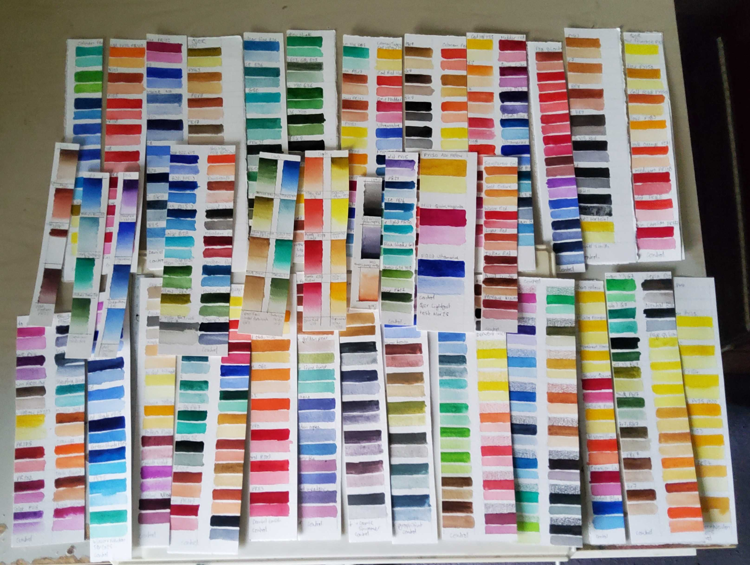
Below are swatches of the colours I currently own.
Viridian, PG18. Phthalo Green blue shade, PG7. Perylene Green Deep, PBK32. Olive Green Light, PY129, PY150, PBr25, PB29.
Yellow Ochre, PY43. Dark Ochre, PY43. Cyprus Raw Umber Brownish, PBr7. Cyprus Burnt Umber Deep, PBr7.
Quinacridone Burnt Sienna, PO48. Red Ochre, PR102. Transparent Brown, PBr23. Caput Mortum, PR102.
Shadow Violet, PB29, PG50, Aquarius Grey, PW6:1
General performance
These paints are highly pigmented in every colour I tested. I started testing these paints directly after finishing my Daler-Rowney Aquafine reviews and the difference is striking. A little goes a long way, and I had to consciously back off and use less paint to get the desired results with Roman Szmal’s paints. Excellent!
These are some of the easiest paints to activate amongst every brand I’ve tried. Only M Graham’s paints have been easier to rewet (they don’t really dry out fully, and are always a bit goopy in the pans). The only colour I found difficult to activate was Viridian PG18, which is often a tricky pigment.
When Mr Szmal labels a colour as transparent, he really means it, and there are plenty of them to choose from. With a couple of other brands (notably Blockx) I’d chosen to buy colours specifically because they were labelled as transparent, and was disappointed with how cloudy they were. None of that nonsense here. I really liked the selection of perylene colours available, and have used the perylene maroon PR179 as a substitute for the beautiful but fugitive alizarin crimson PR83.
There is also an array of strongly granulating colours. Potter’s Pink PR233, Cobalt Violet Light PV49, Cobalt Turquoise PB36. Cyprus Raw Umber Brownish PBr7 and Caput Mortum PR102 all create delightful textural effects.
I notice that these paints disperse readily wet in wet, flowing freely across the page. This can make some of the finely divided small pigment paints (phthalos, quinacridones, perylenes etc) a little hard to control, but once they dry they tend to stay in place.
Lightfast Test Results
When I initially got a box of these I cut swatches in half, putting one half on a wall that gets a fair bit of sun and the other in a folder in a drawer. I let them cook for 2 years then compared both halves. The only colour where I noticed a change was shadow violet, which looks slightly less purple after exposure.
Mixing and Layering
I chose 3 transparent single pigment colours for the mixing wheel. They mixed cleanly, with some saturation loss in the purples, probably from using such a greenish blue.
They also layered nicely. This scan is a bit wahsed out, the page much darker and more vibrant in person. The transparent colours get darker as you layer them (as they should) and you can see some of the covering power of naples yellow light and nickel titinate yellow.
One advantage of having a variety of granulating paints, as well as smooth transparent ones, is you can make your own separating mixtures. Similar to “super granuating” convenience mixtures, the heavier granulating pigment settles out and forms a speckled texture within the more freely dispersing pigment. You can also make super granulating mixes by combining multiple granulating paints. Not always easy to control, but can be a fun and easy way to create texture, and a time-saving way to imply detail.
Test Paintings
I have a ton of paintings where I used these in combination with White Nights, but not so many where I only used Roman Szmal. Here’s an adorable unicorn painted with only Roman Szmal Aquaruis for your viewing pleasure.
The next two paintings were completed following tutorials by Geoff Kersey.
And this one was painted from my own photograph:
The paints performed admirably at every turn. I had no trouble getting the depth of value or hue saturation that I wanted. The mixed and layered without getting chalky, shiny, soapy or any other weird thing you might get with substandard paint. The granulating colours were fun to play with, and they even offer a few premixed separating paints, such as shadow violet. I haven’t used shadow violet in these test paintings though, as it changed hue in my lightfast test. All other colours that I tested appear to have great lightfastness.
Verdict
One of the reasons it took me so long to put out this review is because I really like these paints and I didn’t want to switch over to testing the next set. I like them a lot, and I’ll be keeping them to continue using once I’ve tested all the other paints in my silly hoard. I’ve run out of Cobalt Violet Light PV49 though. Its a delightful paint, but weaker than most (normal for this pigment) and I’ve used it to death. RIP.
If you like pan paints I highly recommend these paints. If you prefer tubes these are probably not the paints for you.
Next time I’ll be reviewing a line of student grade paints- Page of London. I was given a vintage set of these recently and I’m curious to see how they handle. See you soon.
Yes, that’s what I’ve been doing for the past three weeks.
What does lightfast mean?
A lightfast substance resists fading when exposed to sunlight (or UV radiation) over a period of time. Lightfastness is not a binary system, but a sliding scale. Some paints fade quickly, while others more slowly. Some are so lightfast that we can’t perceive any changes within a human lifespan.
Paints which fade quickly are often referred to as fugitive. Paints which do not fade (or take a very long time to fade) are sometimes called permanent, although permanence would include other factors such as resistance to humidity, temperature and acidity.
Industry standards
The two most common measuring systems are The Blue Wool Scale and ATSM (American Standard Test Measure).
Blue Wool Scale scores paints from 1 to 8. 1 is rated as poorest, fading in less than 2 years in “normal lighting conditions.” 8 is the most lightfast, and should be okay to display for 100 years or more in normal lighting conditions. According to Wikipedia normal lighting conditions are defined as “Away from a window, under indirect sunlight and properly framed behind a UV protective glass.”
ATSM rates paints between I-V. These are in the opposite order to BWS, with I being the most lightfast and V being the most fugitive. V is equal to 1 on the BWS, IV to 2-3, III to 4-5, II to 6, and I to 7-8.
Paint manufacturers may also do their own tests, and categorise paints on a totally different scale. Common ones are rating paints out of three stars, or four. You’d have to find out from each individual brand what their star ratings mean.
Does lightfasntess matter?
Yes, and no. It depends what you want to do with your paintings.
If you’re going to display of sell your original paintings it absolutely does matter. Even if you’re framing them, and even if they’re not being displayed in a particularly sunny spot.
In the past I’ve given paintings to family and friends. I remember being horrified when I went to visit a friend a couple of years later and the hues of one of my paintings were no longer at all what I had originally painted. The blues, greens and blacks appeared way more dominant, as some of the other colours had partially faded away.
It’s one thing to be personally embarrassed by a faded painting that had been a gift, but if that painting had been sold as professional work it would probably anger the customer and undermine the artist’s reputation.
On the other hand, if you only paint in a sketchbook for your own pleasure, or scan/photograph your work to sell as prints, then the lightfastness of your paints is not relevant.
Problems with lightfastness ratings on watercolours
Some companies rely on their own tests or unorthodox rating systems. Finding out what their stars are supposed to correspond to, or how the paints were tested, can be difficult or impossible.
Some paint manufacturers rely on generic tests done on the pigments, rather than the actual paints they make. Some pigments vary in quality and lightfastness from different suppliers, or even different batches from the same supplier.
Most paints are tested in masstone (full strength only) but watercolour is often used very diluted to create transparent washes. Some pigments are far more stable at higher concentrations. This has led to cases of a paint being given a top lightfast rating, but fading dramatically in watercolour. For example see Kim Crick’s findings on PO64.
So what can we do about it?
One strategy is to stick to pigments that have been around for a long time and reliably come out with great lightfast ratings. For example PBr7 has been in use a long time and widely reported as durable.
Another is to research tests done independently by other artists. Handprint is an incredibly valuable and detailed resource, although some information is gradually becoming out of date as paintmakers update their formulations and new brands enter the market. Kim Crick does fantastic and rigorous tests on watercolour paint, as do many others, if you look around.
The most definitive way to know how the specific paints you own will perform is to test them yourself. Which is how I’ve found myself with a mountain of 300+ paint swatches.
A few of these were done a while ago. The gradated swatches of Roman Szmal paints have been on display for 2 years. I’ll share my findings in the upcoming review of those paints, which should come out this week.
Most of them are painted fresh, and have already been cut in half, one half as a control which is going in a box in a drawer, well away from light exposure. Before I put the exposure strips up, I’m just waiting for my official blue wool test scale to arrive.
My older tests were just pinned to a sunny part of a wall for a year (or 2) and the paints that didn’t fade got a “well I guess this is fine” from me, but I want to be more accurate with the tests I do from now on. Using an official test strip will let me know when my paints have received enough light exposure to pass for a specific BWS rating.
I need to use my window as a goddam window, so my tests are on a sunny indoor wall instead. I expect this will cause my experiments to take much longer than a standard test.
All the new swatches are painted on the same paper- Winsor and Newton’s professional cold press. So there shouldn’t be any yellowing of the paper to throw the test results off.
I’ve prepared tests for almost every colour I own. I’ve ommited some whites because I don’t think I’d be able to asses changes in white paint on white paper very well, and I seldom use white watercolour anyway. I haven’t tested the Kuretake granulating colours, but you can see how they did in Soo’s video here.
Almost all colours have been painted in two stripes, one at masstone, and one in a more diluted wash. I did this by eye, without measuring the ammount of water I added to each mix precisely, so it won’t be the most scientific test. I still think this is much better than only testing the masstone. I’ve done a single strip for the Cosmic Shimmer paints, because they need to be applied quite thickly to get the sparkle effect to work.
I’m also testing my Derwent Inktense pencils here, as I like them a lot but Derwent’s lightfast ratings are only accurate for the pencils when applied dry. I want to see how they do when activated with water, because that is primarily how I use them. These have 3 strips, one dry, one where the pencil was applied to the paper and activated with water, and one which was painted directly as a more diluted wash.
Once I have the test scale arrives I’ll set them cooking and check them once a week by eye. As each blue wool strip fades I’ll report back with any paints that also show fading. These test results won’t be be purely based on light, the paints are also being subjected to background air pollution (I live on a busy main road) and the changes in temperature and humidity of a fairly typical UK home.
I think that’s it for now. I’ll be back with that Roman Szmal review soon. Toodles.
A pigment is a chemical compound that gives your paint its colour. Historically these may have been powders from ground up rocks, or laked dyes derived from plants. The majority of modern pigments are synthetic. There’s a whole history and chemistry lecture to explore in the nature of pigments, but today I just want to provide a quick and dirty low-down on why we care about which pigments are in our paints, and how to tell what they are.
The most obvious point is that the pigment will determine the hue and value of your paint. The pigment also has a big impact on other important behavioural qualities.
How opaque or transparent the paint will be.
The tinting strength of the paint.
The staining power of the paint.
Whether the paint is granulating, or smooth.
The maker’s specific recipe will also influence these things. The milling process and added fillers, brighteners, humectants and surfactants all play a role, but often the pigment will have the largest impact.
How to find out what pigment is in your paint.
Each pigment compound gets assigned two codes. The Colour Index Constitution Number is a 5 figure number, making it difficult to memorize or recognise.
The Colour Index Generic Name Code is much more intuitive. In watercolour paint this will be in the format P(for pigment) followed by a letter code for the colour family (R for red, or B for blue, Br for brown etc.) then a number up to 3 digits long. For example PR108 is the generic name code assigned to Cadmium Red. Occasionally you might find a N instead of a P. For example the code for Winsor and Newton’s Rose Madder Genuine is NR9.
The majority of artist grade paints will have the generic name codes somewhere on the packaging, although they are not legally required to disclose this information.
Below I’ve included two examples of clear pigment labelling along the side of the paint tube. In this case both paints are made from PY43, yellow iron oxide.
Yellow iron oxide PY43 (natural) or PY42 (synthetic) is an inexpensive, widely available and permanent pigment, so there’d be no reason to use anything else to make yellow ochre, right. Right?
Wrong. As shown in the above image, White Nights yellow ochre is made from a mixture of PY43 and PY154. It also paints out as a significantly lighter colour than either the Daniel Smith or the Winsor and Newton examples. This brings us to the next point:
The marketing colour name may not correspond with the pigment.
Paint manufacturers can give their colours any name they choose, and their marketing gurus will choose names based on what they think will sell. These usually fall into one of three groups:
Traditional. Generally these are names associated with current pigments such as Cobalt Blue or Cadmium Red. They also include historical colours such as Sepia or Vermillion. If the pigment is currently available (for example Cadmium Red) the paint should either contain the associated pigment, or be labelled as a “hue” paint, but always check to make sure. Sepia is no longer made from cuttlefish ink and may contain a variety of pigments designed to imitate the original red-brown colour.
Romantic. Colour names that may be either practical or poetic descriptors of how the colour appears or what you might paint with it. Examples might be “Bright Pink”or “Moonglow” or “Undersea Green.” These may be multipigment mixtures. They might be pigments where the generic name is difficult to remember or pronounce, making it less marketable.
Branding. This is where the company uses their own name as the paint colour descriptor, for example Winsor Red, (PR254 Pyrrole Red) or Blockx Red (also PR254 Pyrrole Red). I don’t really understand why paint makers do this. They usually (not always) stamp their own name on single pigment colours made with reliable modern synthetic organic pigments.
Same pigment, different colour names.
The above image shows examples of three paints with very different names, but the same pigment ingredient. From left to right we have Qor’s Phthatlo Blue Green Shade, Winsor and Newton’s Winsor Blue Green Shade and White Nights’ Bright Blue. In this case I believe Qor’s labelling is the most useful, as the pigment name is PB15 Phthalocyanine blue.
Despite the different names, all three are similar in hue, transparent and staining, with good tinting strength.
Same name, different pigments.
The reverse can and does occur. Take a look at this party pack of Hooker’s greens.
Although all these paints are relatively transparent, there is a lot of variety in the hue and value.
Sometimes I want to match a paint colour from another brand, either because I’m following an instructor who uses a brand I don’t have, or because I’ve run out of a favourite colour and want to pick a similar replacement from the mini mountain of paint I already own.
It is usually a much more reliable to match colours using the pigment code, rather than looking for a colour with the same marketing name.
This also makes it possible to imitate convenience colours you might not have. For example I have a sample of Daniel Smith’s Undersea Green, which is a lovely colour. It is made from PB29 (Ultramarine) PO48 (quinacridone burnt orange) and PY150 (Nickel Azo Yellow) all of which I own as single pigment paints. If I can get the proportions right I could potentially mix a very similar paint.
Hue paints
Another thing to keep an eye on is paints where the name has hue written at the end. These are designed to imitate colours where the genuine pigment is either fugitive, toxic, expensive, or a combination of all three. I’ve also seen hue colours labelled as “tint” or “imit” which is presumably an abbreviation of imitation.
Hue paints are more common in student grade ranges (replacing expensive pigments)but they can be valid in artist grade ranges, for example as a more permanent alternative to the genuine Alizarin Crimson PR83.
How close these imitations are varies wildly, so I’d suggest investigating them on a case by case basis.
For example Aquafine’s Alizarin Crimson (hue) is paler, pinker, and duller than any of the 3 genuine alizarin crimson paints I’ve tried, which were all very similar. On the other hand Aquafine’s Cadmium Red (hue) is a similar colour to a real cadmium red, sitting somewhere between my Winsor and Newton Cadmium Red and my White Nights Cadmium Red Light. It is however more transparent than either of the real cadmium reds, so that’s something to keep in mind.
Get to know your paints
When following an instructor I like to paint with what I already have, which sometimes requires substitutions. Knowing the generic name code for the pigments in my paints allows me to make more informed choices for a close match.
It is also very useful if you run out of a paint, only to find it has been discontinued. You may find the same pigment is still available from a different brand, or under a different marketing name.
What do you think? Do you rely on the marketing names to chose your paint colours, or do you go by pigment codes?
Aquafine is a range of watercolour products made by Daler-Rowney. They are cheaper than the Artist’s (professional) range, and more expensive than the Simply (budget) range. They don’t explicitly state that Aquafine are student quality, but logically that’s where they fit in.
The box I’m reviewing today was part of a collection of “art thingies” that belonged to a friend of a friend who sadly passed away recently. The box has some age to it, with the packaging design being outdated. A few of the colours are made from different pigments to those in the current range. It doesn’t look like the previous owner ever actually used the paints.
About the box
I received this set in the original cardboard packaging box above. This has company branding and some basic product information in 5 languages.
Inside is a leaflet with a chart of the full colour range, some basic tips for new painters and two short tutorials.
Of much more interest is the plastic box which actually houses the paints. This has some interesting features I haven’t seen before.
It is quite a substantial box for just 10 colours. There is some company branding on the lid.
Opening things up provides some explanation on why the box is chunky. There are a series of mixing wells in the lid, and two slider wings which pop out of the sides. It’s like one of those transforming robot toys, except paintyer. Yes that’s a word now.
It is worth noting that all these mixing areas are removable, which is a genius idea because it makes them much easier to scrub clean.
I don’t think this particular set is still being produced, but this box design is still being sold. It is now part of Daler-Rowney’s Artist’s watercolour range (sold with a black lid instead of blue), and comes filled with 20 half pans. So if you fancy a box with tons of mixing areas, that option is still out there.
I think the box design has some very good ideas going for it, but not necessarily a good fit for me. Some of the mixing areas were too small to meet my needs, and the plastic stained easily. I just prefer a larger ceramic mixing palette in the studio, and this box is a bit too big and heavy for me to want to travel with it.
The set also comes with a very serviceable number 4 brush. It holds more water and points better than the brush that was included in the travel pan set.
The paints
There are 10 tubes, each containing 8ml of paint. The front has the colour name, permanence and transparency information.
Pigment information is also provided along the side of the tube. On the back is the barcode, company web address, and a little box that says “no health labelling required.” This is good to know if you have kids or pets that might get into ’em.
The colours
Chinese White PW4, PW6
I’m gonna be real, I only used this colour maybe twice. I just don’t reach for white watercolour often, if I want to add white I use gouache instead, because of its greater covering power.
Lemon Yellow PY3
Almost identical to the lemon yellow in the pan set. The fresh tube paint seemed slightly brighter and clearer, but this is probably only because I’ve been using the pan version a lot and contaminated it with other colours.
Vermillion (hue) PR4
This is a pleasing bright warm red with good tinting strength, but PR4 is not lightfast. See technical pigment info here. According to KimCrick’s article here PR4 shows signs of fading in 1-3 months.
NOTE: This colour is now made with PR255, Pyrrole scarlet, which is much more lightfast.
Alizarin Crimson PR83:1
Alizarin crimson is a beautiful cool red, but unfortunately widely reported as fugitive when diluted. In the current Aquafine colour chart and my pan set it has been replaced by PR176, which is more permanent in masstone.
Having no permanent red really put me off this set, it’d have to be confined to sketchbook practice only. Daler-Rowney has clearly done work to correct the issue in recent years, so if you buy a new set of Aquafine paint you should not have this problem.
Ultramarine PB29
A saturated warm blue, I liked this one better than the Ultramarine Blue Deep in the pan set. This definitely has higher chroma, and seems to have stronger tinting strength too. Possibly my favourite colour in the set.
Prussian Blue PB27
A dark cool blue. This one rewet easily, which makes it much better than my Winsor and Newton Cotman tube of Prussian Blue, which dries into an unusable rock.
PB27 is another pigment with questionable lightfastness. To quote KimCrick’s article “Some student brands like Daler Rowney Aquafine, as well as Winsor and Newton Cotman, seem to have unusual texture problems as well as dramatic irreversible fading.”
Viridian (hue) PG7
Phthalocyanine green PG7 (blue shade) is a very reliable cool green. This colour has good tinting strength and painted out well. As usual with phthalo green it is transparent and staining.
Yellow Ochre PY42
Quite similar to the yellow ochre in the pan set, this earth yellow is incredibly useful in situations where the bright cool lemon yellow is too strident.
Burnt Sienna PBr7, PR101
I prefer the new formulation in the pan set, which is a single pigment paint and distinctly more of a orangey brown. This one is more of a chocolate colour.
Ivory Black PBk9
A warm black with good tinting strength. I found this colour dispersed readily, flowing across the page wet in wet. I haven’t used this one all that much, as I find black can sometimes deaden and overwhelm other colours.
Overall I feel that the colour selection isn’t exactly bad, but it isn’t for me. If I remove the 3 fugitive colours, and the black and the white which I don’t have much use for, then I’m only using half the set. The box is specifically moulded to fit the Aquafine watercolour tubes, so I can’t just drop in other brands to substitute colours I’d prefer.
Test paintings
Colour wheel
Mixing lemon yellow, ultramarine blue, and alizarin crimson gave satisfying results.
Layering and Transparency
Colours are generally quite transparent, if a little weak.
Projects
This was done only using colours from the tube set, and a ballpoint pen. The colours mix nicely, I was able to get a skintone without losing luminosity. I used some black on the boot bcause the burnt sienna and ultramarine mix wasn’t going as dark as I wanted.
This one is mostly tube paint, with the addition of raw sienna from the pan set. The paints flowed nicely wet in wet, and lifted easily to create the cigarette smoke. I was able to get some saturated colours- see the yellow staple gun, but overall the painting came out lighter than I had originally intended.
This one is on hotpressed paper, which helps colours look brighter and more vibrant. I had fun with the splashy background, but ended up finishing off some details on the figure with coloured pencils because I couldn’t get the values dark enough and it was just getting dull the more I worked on it.
Use it or lose it?
This set just isn’t for me. Neither the box nor the colour selection are well suited to my needs. However the colours are fairly vibrant, and behave as watercolours should. They flow nicely, and have no weird soapy or chalky texture. There’s loads of paint left and the box is in good working order, so I’ll donate the box to local charity and hope someone picks it up who will enjoy the set and use it.
Aquafine is a range of watercolour products made by Daler-Rowney. The line includes watercolour tube and pan paints, inks, brushes, paper and gouache. Aquafine is Daler-Rowney’s mid-grade watercolour line, they also offer Artists’ professional watercolour, and a basic entry level range called Simply.
What is included in this set
The set comes in a sturdy white plastic case, roughly the same size as a smart phone. The box feels sturdy, and the clasp holds it securely shut, so it won’t flop open in your bag. There is subtle branding, with the Daler Rowney name debossed into the lid. Inside there are 12 half pan watercolours, and a size 4 travel brush. The bush is smaller than what I’d choose, but works fine. The lid has 3 decent sized mixing areas.
There are also small oval wells on either side of the paint pans. I’m not sure what their intended purpose is, but I use them for keeping a small blob of white gouache for creating opaque mixes.
To paint on the go all you’ll need is some water (or a waterbrush) and a sketchbook. Easy.
The packaging shows a picture with the paint tray removed from the box (to make more mixing space) but I’ve only removed the tray once and I don’t recommend it. The fit is really tight and I thought I might break the box getting the paints back in.
The paints are held in individual plastic half pans which can be removed and swapped around. They have the colour names and pigment numbers printed on the side, which is super helpful. I wish more paint makers did this.
Performance
The paints rewet easily and are strong and bright enough to get the job done. Earlier this month I painted a master swatch sheet of every watercolour I own and the primary colours were slightly weaker and more opaque than other brands but the others were all artist quality and most of them are more expensive, sometimes three or even four times the price per ml. The difference in quality is less obvious in the earthtones, which hold their own when compared with much more expensive paints.
Below is a swatch sheet, and a simple colour wheel.
There are four (correctly indicated on the packaging) hue colours here, the Gamboge, Cadmium Red, Alizarin Crimson and Cobalt Blue are all replacements of toxic, fugitive, or expensive pigments.
The colours all painted out well, none of them felt chalky, soapy or gritty, which can all be issues with low quality paint. In general these paints have lower tinting strength than the White Nights line I looked at in the previous post, with the exception of Yellow Ochre, which was pretty good here and disappointingly weak in White Nights.
A look at the individual colours
Lemon Yellow PY3
Lemon yellow is made with Hansa Yellow, and is a good semi-transparent cool yellow.
Gamboge Hue PY155, PR242
Gamboge Hue has rather weak tinting strength and I’ve run out of it. It mixes well despite being a multi pigment paint.
Cadmium Red Hue PR242
A really bright red, and one of the strongest primary colours in the set, More transparent than a genuine cadmium, and mixed well.
Alizarin Crimson Hue PR176
Alizarin Crimson Hue is made from a more permanent pigment than genuine Alizarin Crimson. It is more of a dull pink than a real crimson, but performs well enough as a cool red.
Cobalt Blue Hue PB29, PW6
Cobalt Blue Hue is a bit too warm in my opinion, genuine cobalt blue is a pure primary blue. I was pleasantly surprised that it doesn’t seem terribly chalky, despite containing white pigment.
Ultramarine Blue Dark PB29
Ultramarine Blue Dark is honestly not very dark and I have to use a lot of it to get a strong enough colour. I ran out of this colour during my final test painting.
Hooker’s Green Dark PY3, PG7, PV19
Hooker’s Green Dark is a convenience green (multipigment mixture) which looks a little unnatural. It is quite useful when modified by adding a touch of one of the earth colours to neutralise it slightly.
Yellow Ochre PY42
A nice yellow earth, I’ve been using it as my warm yellow after running out of Gamboge.
Light Red PR101
This earthtone is almost a soft pinnkish colour when diluted, useful for nature studies.
Raw Sienna PBr7
This dull yellowish brown is useful but in my opinion not as impressive as the other earth colours in the set.
Burnt Sienna PR101
I particularly like the burnt sienna as it is transparent, and is effective for mixing neutrals with the ultramarine.
Payne’s Grey PBk7, PB29
Payne’s Grey is nice and strong, and will go dark without appearing chalky, allowing for a full value range
This seems like a well balanced selection of colours, and I was able to mix whatever hues I wanted from what’s included here. I have not run lightfastness tests on these, as they are student grade paints and I’ve mostly used them for quick sketches and studies. The pigments listed above generally have good or excellent lightfastness ratings.
Test paintings
I’ve had this set since it arrived as part of a Scrawlrbox (which probably needs a post of its own) a few years ago, and filled a couple of small sketchbooks with these paints back in 2022. Below are some more recent paintings to refresh my memory of how the paints perform.
While I’ve mostly used these for small sketches I recently did a couple of larger paintings to see how they held up on more finished work. The above image used every colour except Cad Red Hue and Light Red, and the one below used only Cad Red Hue, Alizarin Crimson Hue, Cobalt Blue Hue, Ultramarine Blue Hue, Yellow Ochre, and Burnt Sienna. They were both done following tutorials from Geoff Kersey- *here* is his website. Not sponsored, I just enjoy the tutorials.
The paints handled well, mixing and layering to create finished paintings as good as any other project I’ve done following Geoff’s tutorials. I’m not happy with the sky in the second one, but that’s a problem with painting too slowly and paper drying unevenly, not a fault of the paint. I honestly forgot I was testing this set when doing these paintings, they were very easy to use and didn’t give any significant frustrations.
This last test painting got frustrating getting the colours as dark as I wanted, the space section took 5 layers and started bronzing so I called it done. It also took all the ultramarine I had left in the pan to do it.
Is the set a good choice for you?
I think this set is a good choice if you are new to watercolour and want to get started on a tight budget. The paints are plenty good enough to learn some basics and (more importantly) have fun.
My main issue is that I ran through some colours quite quickly, but you can always refill those most used colours with more potent artist grade paint, buying tubes one at a time as needed.
I also think it is a nice set if you’re interested in painting on the go. The box is compact and sturdy, and I had fun painting plein air with it. Of course if you’re an experienced plein air painter you probably already have a setup that’s just how you want it, but as a newbie travel sketcher this box made me happy.
This set is not a great idea if you like to paint BIG. Getting enough colour off the pans gets a bit tedious for anything over A4, especially if you want bold saturated colour and a full value statement.
Use it or lose it?
I’ll be keeping this one, the box is handy and practical, and the choice of colours included is pretty solid. I’m not in love with the paints themselves, so as they run out I’ll be refilling from artist grade tubes instead of replacing with more Aquafine paint.
I purchased this set back in 2021. Before the war in Ukraine. I’m not trying to promote the brand, just provide a source of information. Let’s talk about paint, not politics.
What are White Nights?
White Nights are a series of professional (artist’s) quality watercolour paints made by Nevskaya Palitra in St. Petersburg, Russia. They’ve been produced since the 1930s, but I didn’t hear about them until the late 2010s.
The paints are available in 2.5ml full pans and 10ml tubes, and I will be reviewing the pans. There are 145 colours in the range, about a third of these being newly added in the last 5 years. A lot of the new colours are multi-pigment mixes, in speciality pastel and granulating ranges. I’ll be covering 37 colours from the classic range.
Pricing
I’ve had the set for almost 5 years, and it cost about £45 back in 2021.
The equivalent 36 set is available for just under £80 at https://www.stpetersburgwatercolours.com. While the price has almost doubled in 5 years this still works out at about £2.20 per pan, with a nice sturdy plastic box thrown in.
That’s incredibly good value for a full pan of artist’s quality paint. The only other artist quality range of full pans I know of near this price point is Rosa Gallery.
The set
Packaging
The set comes packaged in this cardboard box, with all information printed in English and Russian. One section is also printed in German, French, Italian and Spanish. The back of the box shows a chart of the included colours, with pigment information. In my set there was no Indanthrene blue, and instead I got Ultramarine Deep. While it would have been nice to try PB60, I was happy that they at least replaced the out of stock colour with another blue, rather than a totally random paint colour.
The box also discloses paint ingredients, listing them as: Pigment, filler, gum arabic, water, additives. While “additives” is a very ambiguous ingredient, I appreciate the transparency of the company providing an ingredient list at all. There are storage instructions which basically tell you not to let them freeze. Also a warning that the set contains zinc dioxide, a guarantee for 5 years from the date of manufacture, and a contact address.
The box
Inside is the plastic box that houses the paint pans, and let me tell you this thing is tough. I am not gentle, as a result, I’ve put the box through the wringer over the last 5 years. The white plastic probably isn’t as bright as it once was but there is no damage whatsoever. The hinge is smooth, the clasp shuts tight, there’s no cracks or dents. I deliberately removed the fold-out mixing tray quite early on, as I prefer to mix on a ceramic palette so it wasn’t useful to me and occupied valuable work space when open.
If you don’t already have a mixing palette then you may appreciate that one is included in the set. There’s also space to store a brush, and you could use the inside of the lid could be used for mixing paint on too.
The pans sit in four recessed rows. Unlike most metal box sets, there are no clips holding them in place. If you want to travel with the set, make sure the mixing flap is in the box, or the paints can be shaken loose and rattle around. Not a big deal, but more than once I forgot to reinstate the flap and then had to put the pans back in their usual order upon arriving on location.
The paints
The pans arrive individually wrapped, with the wrapper giving the colour name, pigment info and a date of manufacture stamp. Also included in the box is a branded colour chart for swatching your colours.
Here is my filled out chart, which fits in the box, although I have it laminated and stuck on my wall as I mostly use the set in the studio, preferring a smaller pocket sized box for travel. Most of the colours are fairly accurate, although it is notable that the cobalt blue does go much darker. At the time of swatching I wasn’t very aware of some pigments having a lower tinting strength than others.
The paints rewet easily, so there’s no need for tedious scrubbing. The paints being full pans also helps with picking up paint easily and helps avoid poking at the paint with the tip of the brush.
In general the paints have good pigmentation, and have lasted a very long time. I’ve been using them as my main workhorse set for years.
White Nights seem to have a bad rep for being fugitive, possibly from older formulations of the paints that haven’t been produced since 2019. I’ve have experienced lightfastness problems in 3 of the colours in this set (less than 10% of the paints) and I’ll talk about them when covering the individual colours below.
With a whopping 36 colours in the set there’s a lot to choose from, and you should be well catered for with whatever you want to paint. As I’ve got more experienced with mixing I find the oranges, purples and greens sit idle these days, but I definitely appreciated the wide colour selection for the first couple of years. There’s plenty of single pigment colours (26/36) and the pigment properties are as you’d expect, cadmiuims are somewhat opaque, phthalos are transparent and staining, ultramarine lifts, and cerulean granulates.
A more in depth look at the colours
Zinc White PW4
Swatch of White Nights watercolour Zinc White
A set this large is probably going to have a white, whether you like it or not. This white is more transparent than the frequently used Chinese white with PW6 and in my opinion is basically useless as a colour. If I want to add white I use gouache, which has better covering power. On occasion I have used this paint to increase the viscosity of a mixture, so it can be dropped onto damp paper without creating cauliflowers, which is pretty niche, but it does serve a purpose. Something I’ve found out more recently is that PW4 can get more more opaque when exposed to light, so that could make mixtures using this paint appear to fade. I haven’t personally experienced this issue as I seldom use this colour.
Cadmium Lemon PY35
A cool, semi-opaque yellow. Useful for adding some vibrant highlights to foliage, and it’s covering power allows for a few touches of light over dark. Can make mixes chalky, I prefer to use it on its own and let the mixing happen on the paper, without fussing with it.
Cadmium Yellow Medium PY35
Another fairly opaque yellow, primary to slightly warm, with good tinting strength. A pleasing colour, though I usually reach for the more transparent “yellow” which I find easier to handle in mixes. The powdery texture does make for interesting mixtures,
Yellow Ochre PY43, PY154
A baffling multiple pigment mix for a usually single pigment colour, this one is disappointingly weak. Yellow Ochre is such a useful colour that I chewed through it pretty quick. I then went on to use use raw sienna as a substitute for this empty colour.
Golden PY3, PO13
A mixture of Hansa Yellow and Benzidine Orange. The orange component has noticeable fading, so the colour appears yellower over time. A brightly saturated orange colour not suitable for works intended for sale or display. Reserve this one for sketchbooking and practice.
Golden Deep PO62
Benzimidazolone Orange produced a similar hue to the Golden colour above, and is more lightfast. I rarely use a bright saturated orange, but when I do, this is the one to go for. I’m not sure why two oranges of almost identical hue were included in the set.
Yellow PY154
Benzimidazolone yellow is a semi transparent primary yellow that mixes great oranges and greens. My go-to yellow, is now sadly empty. Winsor and Newton’s Winsor Yellow is made with the same pigment number, and is very similar in hue and behaviour.
Titan Red PO36
Benzimidazolone scarlet is a reddish orange that when sufficiently diluted makes a wonderful peach colour that is a suitable base for (cartoonish) Caucasian skintones. I relied on this colour for this purpose for quite a while, but a little goes a long way, the pan is still more than half full.
Ruby PR170
Made with Naphthol Red, a pigment known for having variable lightfastness. I haven’t noticed fading in mine, but I don’t know if there might be variation between batches, so this is one to test yourself before using in paintings you want to be archival. A very intense red, and quite pretty. Not one I reach for often, but that’s because there are a lot of reds to choose from in the set, rather than because I dislike it.
Cadmium Red Light PR108
An opaque, warm red. I suspect there is some filler in this one, it doesn’t seem to go as far as the cadmium yellows. If I want a warm red I tend to use Titan Red above, as it goes further and when thinned down is quite transparent.
English Red PR101
A *very* strongly pigmented opaque earth red. I find it tricky to handle because it has a very large drying shift- desaturating significantly as it dries. I think it will make a very useful colour for painting natural subjects if I can pre-empt the colour changing as it dries.
Quinacridone Rose PR122
A very saturated transparent pink with tons of tinting strength. Nice colour for florals, and mixes with ultramarine to make a lovely purple.
Carmine PR19?
I can’t find much info on PR19, and think it might be a typo of the frequently used PV19. Another pink colour, this one is a bit warmer than Quin Rose above, and an excellent cool red for mixing with.
Madder Red Lake Light PR187
Made with an unusual pigment that I can’t find a ton of info on. This transparent colour reminds me of red wine, I’m drawn to it quite a bit. Looking for a substitute for when this runs out, I’ve found perylene maroon, PR179, to be quite similar.
Quinacridone Lilac PV19
A dark, muted purple, with high tinting strength so a little goes a long way. More permanent than the Violet, below.
Violet PV3
My apologies for the bronzing on this swatch, I was not used to such strong colours when I painted these out. A dark, intense purple that is very pretty when freshly painted but goes brownish when exposed to sunlight. Unfortunately one best reserved for the sketchbook, not for professional use.
Here’s the lightfast test result, with 2 years exposure to indoor light on the left, and the control on the right. Even with my poor photography skills, the difference is obvious.
Ultramarine PB29
A common staple of many painters Ultramarine is a saturated, lightfast, warm blue. This one has good pigmentation and subtle granulation.
Bright Blue PB15:3
This is Phthalo Blue, green shade, and is an excellent example. Very very high tinting strength, this one has lasted well despite frequent use.
Cobalt Blue PB28
One of the weaker colours in the set, which would be expected from an expensive pigment with naturally low tinting strength. A very useful primary blue, which got completely used up. This colour had the most pronounced granulation in the whole set, and I had fun using it for textural effects. I bought a pan of cobalt blue from Rosa Gallery to replace it, and it is ever so slightly stronger, and much smoother with little granulation.
Ultramarine Deep PB29
Almost identical to Ultramarine above, but fortunately it is a very useful colour so I don’t see it as a problem. As the name would suggest, this one goes slightly darker at full strength.
Turquoise PB15, PG7
A convenience mix of phthalo blue and phthalo green, strongly staining and transparent. I use this one less frequently than either of its constituents, but it is a pretty colour that behaves itself in mixes.
Indigo PBK7, PB15, PV23
Technically a hue or imitation colour, genuine indigo NB1 is neither lightfast, nor widely available in watercolour paint. A very dark blue masstone, appearing as a cool grey when diluted.
Ceruleum Blue PB35
Presumably a typo of cerulean blue, which is the common name for PB35. A pale pastel blue, lovely for subtle skies.
Yellowish Green PG7, PY3
A bright, saturated green. Looks garish straight from the pan, would want to tone it down by mixing if I intended to paint anything natural-looking. Might suit cartoons or a certain style of illustration work.
Emerald Green PG7
This is phthalo green blue shade and possibly has the highest tinting strength of any paint I own, including those with double the price tag. Absurdly pigmented little box of magic. Not very natural on its own and stains like a b*tch (half my brushes are stained green because of this bad boy) but mixes very well. Mixing this with a transparent red makes a darker tone than the neutral black provided below.
Green G8
Nitroso green is a beautiful dark, natural looking single pigment green, which is unfortunately fugitive when diluted. Stable in masstone, but not worth the risk if you want to display your paintings. I love this colour, and I used it a lot when I first got his set. I used it in a couple of giftcards for my mother, which she loved and displayed. Two years of indirect sunlight later and light washes of this green had almost completely disappeared. Do not make the same mistake I did, reserve this one for the sketchbook.
Lightfast test for Green (PG8) showing fading to the diluted paint on the left card.
Olive Green PG17, PY1, PBK7
A convenience green which I used a fair bit when I was new to watercolours. One of the components, PY1, is less lightfast than the others, and the hue may appear less warm after prolonged exposure to sunlight. Less grievous than the fading in “Green” above, as the paint holds its value (darkness) and takes much longer for any change to be visible. I probably wouldn’t have noticed if I wasn’t specifically *looking* for fading, although the oldest paintings I have done with this are under 5 years old. I’d be comfortable giving someone a card painted with this colour, but not selling the work. If the colour continues to fade over longer periods it could bite you in the arse and damage your reputation as a professional.
Chromium Oxide Green PG17
This military green uses the same pigment commonly used in camouflage paint. An opaque colour, it can make paintings chalky or muddy if used thickly and fussed with. In diluted washes is makes a lovely pale grey green for distant foliage.
Raw Sienna PY43
A yellowish earth tone and one of my go-to colours, especially after I ran out of yellow ochre. This is a little darker and stronger than the yellow ochre, and a single pigment.
Burnt Sienna PBR7
This orangey-red earth tone is easier for me to paint with than the English red above, as it has a much smaller drying shift. Semi-transparent and non staining, a valuable mixing colour.
Umber PY43, PBR7, PBK7
Umber is often created with a single pigment so this multi pigment mixture is a little baffling. A cool, almost greenish brown, I used it a lot when I first got the set as it goes quite dark and cool dark browns can be hard to mix.
Burnt Umber PBR7
The colour of milk chocolate. I prefer burnt sienna for my warm earth tone, but there’s nothing to complain about with this colour either.
Mars Brown PBR6
A transparent version of a traditionally opaque pigment. A granulating mid brown.
Sepia PR102, PBK7, PR187
The darkest brown in the set. Sepia was originally made in the 18th century from the ink sacks of cuttlefish, it is now made from a mixture of pigments. Since I learned to mix a dark brown from burnt sienna and ultramarine I use this paint less frequently, but still a nice colour to have available.
Neutral Black PR187, PB15, PBK7
What it says on the tin. A premixed neutral black, all ready to go.
Paynes Grey PBK7, PB15, PV23
This goes just as dark as the black next door, but has a cooler tone. Less noticeably blue than the other payne’s grey paints I have (from M Graham and Daler Rowney) this pan is now empty, as I used the colour for dozens of value studies.
(bonus) Irgazin Yellow PY129
Purchased open stock on a whim shortly after obtaining the set, this single pigment green gold colour is transparent and staining. Green in masstone and yellow when diluted, its a very interesting colour. I like it for foliage.
Technical testing
Below is a colour wheel test, to show the results of mixing 3 primaries. If I still had any “yellow” (PY154) left I would have chosen it for this exercise, but was pleasantly surprised by the Cadmuim Yellow I was forced to use instead. The greens it mixed aren’t quite as bright, but it creates an interesting subtle texture where it wanted to separate out from the blue (phthalo PB15).
With the wet in wet mixed bars on the second half I tried out a couple of different primaries. Swapping the phthalo blue for ultramarine gave more vibrant purples, but dull olive greens.
Also shown are a number of the colours layered over one another. This shows which paints are more opaque vs transparent. To a lesser extent is shows whether the colour applied first reactivates and lifts when a single paint stroke is gently applied over it. You can see that the chromium oxide green is very opaque, and the emerald (phthalo PG7) is much more transparent.
Completed paintings and projects
Regardless of whether you like what I chose to paint, there’s no denying that these paints can create a full range of hues and values.
Key strengths and weaknesses
Pros
Paints offer a lot of bang for your buck. The quality of paint for the price is kind of a steal, I like these better than Daler Rowney Aquafine- a good student quality line in the same price range. Rosa Gallery is similar in price but I’ve only tried one colour so it would be unfair to extrapolate the entire range from one pan. Some of the colours hold their own compared to much more expensive examples of the same colours from other brands.
Most colours are well pigmented. The Phthalo based colours in particular are incredibly strong.
Paints come in a very durable box. It’s a bit to big and bulky to make a nice travel set, but that’s not what the box is marketed as, or what I bought it for.
The labelling is clear, with pigment information provided on both the box and the individual pan wrappers. There are a couple of possible typos with the PR19 and Ceruleam but it doesn’t feel like information is being deliberately obfuscated. Colour names are sensible, with names such as cad red light, quin rose and cobalt blue directly indicating the actual pigments they contain rather than some fanciful marketing BS names like “Christmas tree green.”
Individual pigment characteristics are apparent, but not obtrusive. This puts them in a goldilocks zone between some brands who seem to deliberately try to mill all pigments to the same particle size so all colours behave consistently, and others where certain colours granulate so aggressively you can feel like a spectator in your own paintings as they do their own thing.
The majority of the paints are single pigment, making mixing a doddle. Most of the multipigment paints are either convenience greens, or modern substitutes for antiquated colours, like sepia.
Cons:
3 of the colours have significant lightfastness problems and are not suitable for paintings that will be displayed. Keep in mind that a *lot* of artist quality paint ranges offer Opera Rose (which includes a fugitive neon dye), Aureolin PY40 (which often acquires brown discolouration), and genuine Alizarin Crimson PR83 (well documented to be less stable than modern alternatives) and this does nothing to harm their company’s reputation whatsoever. If you only want lightfast paints you could ditch the 3 problem colours and still have a large, well balanced set of colours for a bargain price. My actual beef over this is that Golden and Green get 2 out of 3 stars for lightfastness on the packaging and they undergo very significant changes within 1 year of display. I don’t have a problem with fugitive artist grade paints being made and sold- as long as they are clearly labelled as such.
There are quite a few opaque colours here, and that’s something I know some watercolourists hate. I don’t think opacity is necessarily a bad thing- I like a dab of lemon for a quick pop of highlight on foliage- but it is more about knowing your paint properties and using them accordingly.
The pans are slightly smaller than standard full pans, at 2.5ml instead of 3. While this doesn’t negate the set being excellent value for money, it does mean that you can’t substitute full pans from other brands into the box- they’re too big to fit. You could refill the empty 2.5ml pans from tubes to work around the issue.
The yellow ochre is frustratingly weak, which is a bit of a let down for such a useful colour that other student paint lines often do well with.
Using a 3 pigment mix to make umber is baffling, and the only logical explanation I can think of is that this was a cost cutting measure.
The current standard 12 pan offering contains the aforementioned disappointing yellow ochre, multipigment umber, and the fugitive green. It also features the 3 cadmium colours which are lovely paints but the opacity can be challenging. If you just want to try a few colours you might be better off picking them open stock, if you can find them.
If buying second hand, make sure you check how old the set is. This set contained more fugitive pigments Prior to 2019-2020.
With current distribution issues, the pricing of vendors is all over the place. Look for deals that still offer these around the £2 per pan mark. If the listing works out at £4 per pan or more look elsewhere. If you have a bit more cash to splash and like full pans Roman Szmal are *lovely* paints and their cheaper series start at around £5 per pan.
Use it or lose it?
This one lands firmly in the use it pile. I have been using it, to the point that a fifth of the pans are now empty. Because I’ve run out of a few of my most frequently used colours I’ll probably be using this in conjunction with other paints to fill in the gaps, but it isn’t leaving any time soon.
You’re here, you found my first blog post. Well other than the test posts. Those were basically me prodding the WordPress interface like a child poking a frog with a stick to see if it jumps.
This is probably gonna be as rough for you to read as it is for me to write, but everyone’s gotta start somewhere.
I plan to set up a gallery page on this website soon to show off my mad art skills, but for now let’s take a moment to cover what the blog is for.
reasons why I’m making a blog
I want to connect with people who share my interests, without feeding all of my data into an endless scrolling money machine. I want you to read what I have to say because it interests you, not because an algorithm shoved it in your face.
I want control over my own content. I’m currently running head first into the learning curve of the setup process, but the intent here is that I’ll be able to choose how my articles and images are presented.
I hope to share information, detailing the tools and materials I like to use, and why.
By talking about the difficulties I’ve experienced with building my skills, and how I’ve overcome them, I hope to save you time and energy. You’ll be able to jump right over such pitfalls.
There are all sorts of resources I can recommend. From courses and books, to my favourite YouTube channels. I’d like to share why I found them helpful, and how they might help you too.
Watercolour testing
Over the years I’ve accumulated a small mountain of watercolour paint, like a dragon with a blonde mullet, sitting on a hoard of gold.
Some of these paints I’ve used extensively, others barely at all. One of the first projects I want to put together for you is to run tests on each brand or set, one by one, and share my findings.
I have no intention of producing a common or garden first impressions set of reviews. You know, basically glorified unboxing and swatching posts. Instead I plan to give each type of paint what I’d call “a fair go”.
By this I mean actually using the paint as my main set for a full month. Then I’ll really be able to tell if the product suits my needs and how the paints behave when the chips are down.
There’s a lot to get to here, so I’m prepared to cut a review short if I run out of a key colour. Or if the paint gets on my tits so much that it puts me off creating.
By the end of the test period I should be familiar enough with the paint to use it on the fly, without second guessing how it will behave. Or I’ll realise that it is not the right paint for me, and lose it by donating it, so someone else can enjoy it, and prevent wasting it by leaving it gathering dust.
I’ll be starting with the box of White Nights full pans, as this is the set that I’ve used most. It is also a set where I’ve run out of a few colours already, so I expect to be back with that post in less than a month.
After that, the order is more flexible. So, if there’s something in the pile that you’d like to see reviewed let me know by leaving a comment and I’ll prioritise it for you.


Leave a Reply