Tag: Aquafine

  • Aquafine watercolour tubes slider set review

    Last week we reviewed the Aquafine pans https://artrumpus.com/aquafine-pan-review/ so lets take a look at the tubes and see how they compare.

    What is Aquafine?

    Aquafine is a range of watercolour products made by Daler-Rowney.
    They are cheaper than the Artist’s (professional) range, and more expensive than the Simply (budget) range. They don’t explicitly state that Aquafine are student quality, but logically that’s where they fit in.

    Aquafine watercolour tube set box

    The box I’m reviewing today was part of a collection of “art thingies” that belonged to a friend of a friend who sadly passed away recently. The box has some age to it, with the packaging design being outdated. A few of the colours are made from different pigments to those in the current range. It doesn’t look like the previous owner ever actually used the paints.

    About the box

    I received this set in the original cardboard packaging box above. This has company branding and some basic product information in 5 languages.

    Inside is a leaflet with a chart of the full colour range, some basic tips for new painters and two short tutorials.

    Aquafine watercolour information leaflet

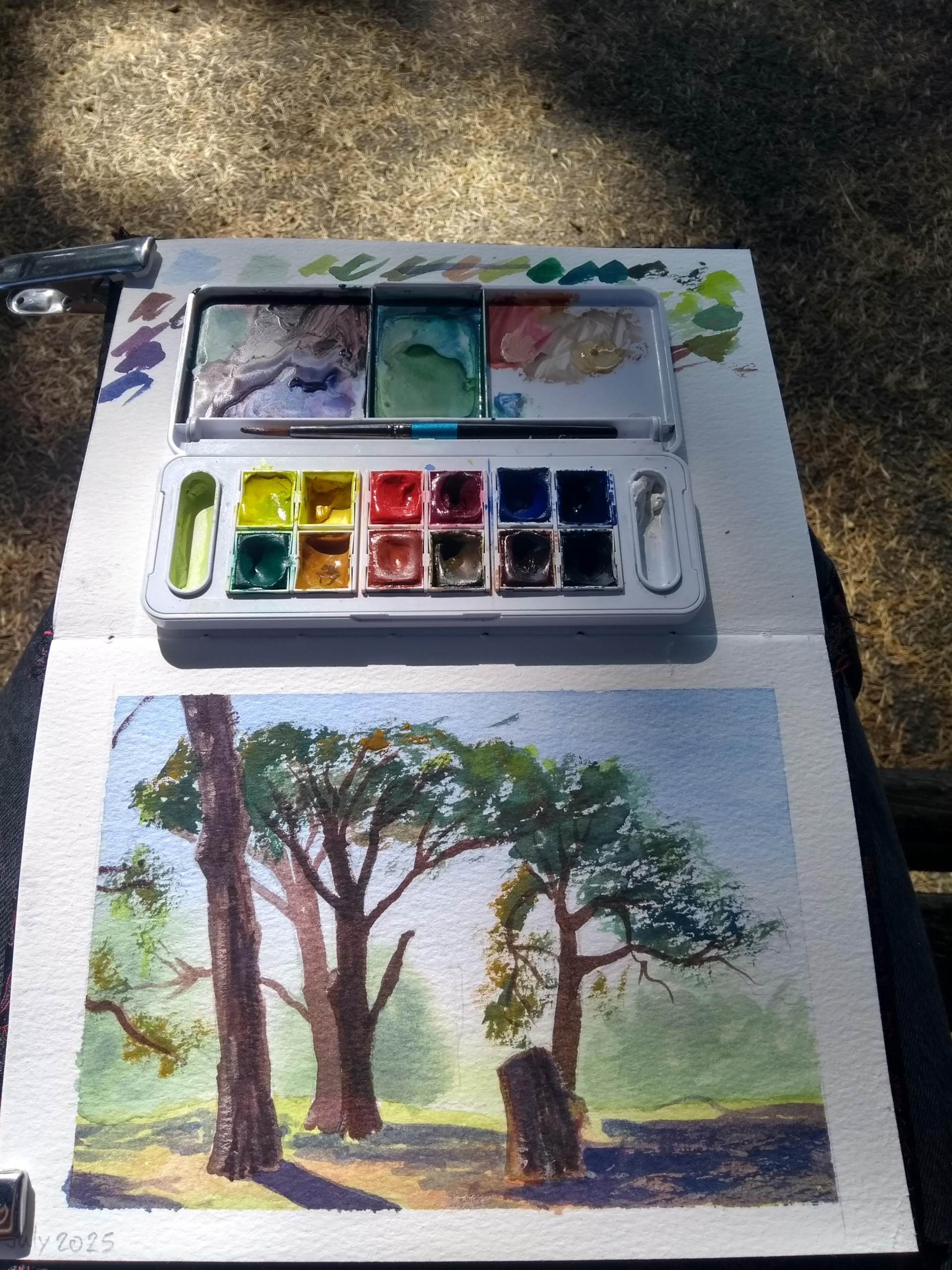
    Of much more interest is the plastic box which actually houses the paints. This has some interesting features I haven’t seen before.

    It is quite a substantial box for just 10 colours. There is some company branding on the lid.

    Opening things up provides some explanation on why the box is chunky. There are a series of mixing wells in the lid, and two slider wings which pop out of the sides. It’s like one of those transforming robot toys, except paintyer. Yes that’s a word now.

    Aquafine watercolour slider box

    It is worth noting that all these mixing areas are removable, which is a genius idea because it makes them much easier to scrub clean.

    I don’t think this particular set is still being produced, but this box design is still being sold. It is now part of Daler-Rowney’s Artist’s watercolour range (sold with a black lid instead of blue), and comes filled with 20 half pans. So if you fancy a box with tons of mixing areas, that option is still out there.

    I think the box design has some very good ideas going for it, but not necessarily a good fit for me. Some of the mixing areas were too small to meet my needs, and the plastic stained easily. I just prefer a larger ceramic mixing palette in the studio, and this box is a bit too big and heavy for me to want to travel with it.

    The set also comes with a very serviceable number 4 brush. It holds more water and points better than the brush that was included in the travel pan set.

    The paints

    Aquafine watercolour tube burnt sienna

    There are 10 tubes, each containing 8ml of paint. The front has the colour name, permanence and transparency information.

    Pigment information is also provided along the side of the tube. On the back is the barcode, company web address, and a little box that says “no health labelling required.” This is good to know if you have kids or pets that might get into ’em.

    The colours

    Chinese White PW4, PW6

    I’m gonna be real, I only used this colour maybe twice. I just don’t reach for white watercolour often, if I want to add white I use gouache instead, because of its greater covering power.

    Lemon Yellow PY3

    Almost identical to the lemon yellow in the pan set. The fresh tube paint seemed slightly brighter and clearer, but this is probably only because I’ve been using the pan version a lot and contaminated it with other colours.

    Vermillion (hue) PR4

    This is a pleasing bright warm red with good tinting strength, but PR4 is not lightfast. See technical pigment info here. According to KimCrick’s article here PR4 shows signs of fading in 1-3 months.

    NOTE: This colour is now made with PR255, Pyrrole scarlet, which is much more lightfast.

    Alizarin Crimson PR83:1

    Alizarin crimson is a beautiful cool red, but unfortunately widely reported as fugitive when diluted. In the current Aquafine colour chart and my pan set it has been replaced by PR176, which is more permanent in masstone.

    Having no permanent red really put me off this set, it’d have to be confined to sketchbook practice only. Daler-Rowney has clearly done work to correct the issue in recent years, so if you buy a new set of Aquafine paint you should not have this problem.

    Ultramarine PB29

    A saturated warm blue, I liked this one better than the Ultramarine Blue Deep in the pan set. This definitely has higher chroma, and seems to have stronger tinting strength too. Possibly my favourite colour in the set.

    Prussian Blue PB27

    A dark cool blue. This one rewet easily, which makes it much better than my Winsor and Newton Cotman tube of Prussian Blue, which dries into an unusable rock.

    PB27 is another pigment with questionable lightfastness. To quote KimCrick’s article “Some student brands like Daler Rowney Aquafine, as well as Winsor and Newton Cotman, seem to have unusual texture problems as well as dramatic irreversible fading.”

    Viridian (hue) PG7

    Phthalocyanine green PG7 (blue shade) is a very reliable cool green. This colour has good tinting strength and painted out well. As usual with phthalo green it is transparent and staining.

    Yellow Ochre PY42

    Quite similar to the yellow ochre in the pan set, this earth yellow is incredibly useful in situations where the bright cool lemon yellow is too strident.

    Burnt Sienna PBr7, PR101

    I prefer the new formulation in the pan set, which is a single pigment paint and distinctly more of a orangey brown. This one is more of a chocolate colour.

    Ivory Black PBk9

    A warm black with good tinting strength. I found this colour dispersed readily, flowing across the page wet in wet. I haven’t used this one all that much, as I find black can sometimes deaden and overwhelm other colours.

    Overall I feel that the colour selection isn’t exactly bad, but it isn’t for me. If I remove the 3 fugitive colours, and the black and the white which I don’t have much use for, then I’m only using half the set. The box is specifically moulded to fit the Aquafine watercolour tubes, so I can’t just drop in other brands to substitute colours I’d prefer.

    Test paintings

    Colour wheel

    Aquafine watercolour mixing wheel

    Mixing lemon yellow, ultramarine blue, and alizarin crimson gave satisfying results.

    Layering and Transparency

    Colours are generally quite transparent, if a little weak.

    Projects

    This was done only using colours from the tube set, and a ballpoint pen. The colours mix nicely, I was able to get a skintone without losing luminosity. I used some black on the boot bcause the burnt sienna and ultramarine mix wasn’t going as dark as I wanted.

    This one is mostly tube paint, with the addition of raw sienna from the pan set. The paints flowed nicely wet in wet, and lifted easily to create the cigarette smoke. I was able to get some saturated colours- see the yellow staple gun, but overall the painting came out lighter than I had originally intended.

    This one is on hotpressed paper, which helps colours look brighter and more vibrant. I had fun with the splashy background, but ended up finishing off some details on the figure with coloured pencils because I couldn’t get the values dark enough and it was just getting dull the more I worked on it.

    Use it or lose it?

    This set just isn’t for me. Neither the box nor the colour selection are well suited to my needs. However the colours are fairly vibrant, and behave as watercolours should. They flow nicely, and have no weird soapy or chalky texture. There’s loads of paint left and the box is in good working order, so I’ll donate the box to local charity and hope someone picks it up who will enjoy the set and use it.

  • Aquafine watercolour paint review (12 half pan travel set)

    Aquafine watercolour paint review (12 half pan travel set)

    What are Aquafine paints?

    Aquafine is a range of watercolour products made by Daler-Rowney. The line includes watercolour tube and pan paints, inks, brushes, paper and gouache. Aquafine is Daler-Rowney’s mid-grade watercolour line, they also offer Artists’ professional watercolour, and a basic entry level range called Simply.

    What is included in this set

    Daler-Rowney Aquafine travel set packaging

    The set comes in a sturdy white plastic case, roughly the same size as a smart phone.
    The box feels sturdy, and the clasp holds it securely shut, so it won’t flop open in your bag. There is subtle branding, with the Daler Rowney name debossed into the lid. Inside there are 12 half pan watercolours, and a size 4 travel brush. The bush is smaller than what I’d choose, but works fine. The lid has 3 decent sized mixing areas.

    The inside of the Aquafine travel set.


    There are also small oval wells on either side of the paint pans. I’m not sure what their intended purpose is, but I use them for keeping a small blob of white gouache for creating opaque mixes.

    To paint on the go all you’ll need is some water (or a waterbrush) and a sketchbook. Easy.

    The packaging shows a picture with the paint tray removed from the box (to make more mixing space) but I’ve only removed the tray once and I don’t recommend it. The fit is really tight and I thought I might break the box getting the paints back in.

    The paints are held in individual plastic half pans which can be removed and swapped around. They have the colour names and pigment numbers printed on the side, which is super helpful. I wish more paint makers did this.

    Performance

    The paints rewet easily and are strong and bright enough to get the job done. Earlier this month I painted a master swatch sheet of every watercolour I own and the primary colours were slightly weaker and more opaque than other brands but the others were all artist quality and most of them are more expensive, sometimes three or even four times the price per ml. The difference in quality is less obvious in the earthtones, which hold their own when compared with much more expensive paints.

    Below is a swatch sheet, and a simple colour wheel.

    Swatches of the 12 colours in the Aquafine travel set.

    There are four (correctly indicated on the packaging) hue colours here, the Gamboge, Cadmium Red, Alizarin Crimson and Cobalt Blue are all replacements of toxic, fugitive, or expensive pigments.

    The colours all painted out well, none of them felt chalky, soapy or gritty, which can all be issues with low quality paint. In general these paints have lower tinting strength than the White Nights line I looked at in the previous post, with the exception of Yellow Ochre, which was pretty good here and disappointingly weak in White Nights.

    A look at the individual colours

    Lemon Yellow PY3

    Lemon yellow is made with Hansa Yellow, and is a good semi-transparent cool yellow.

    Gamboge Hue PY155, PR242

    Gamboge Hue has rather weak tinting strength and I’ve run out of it. It mixes well despite being a multi pigment paint.

    Cadmium Red Hue PR242

    A really bright red, and one of the strongest primary colours in the set, More transparent than a genuine cadmium, and mixed well.

    Alizarin Crimson Hue PR176

    Alizarin Crimson Hue is made from a more permanent pigment than genuine Alizarin Crimson. It is more of a dull pink than a real crimson, but performs well enough as a cool red.

    Cobalt Blue Hue PB29, PW6

    Cobalt Blue Hue is a bit too warm in my opinion, genuine cobalt blue is a pure primary blue. I was pleasantly surprised that it doesn’t seem terribly chalky, despite containing white pigment.

    Ultramarine Blue Dark PB29

    Ultramarine Blue Dark is honestly not very dark and I have to use a lot of it to get a strong enough colour. I ran out of this colour during my final test painting.

    Hooker’s Green Dark PY3, PG7, PV19

    Hooker’s Green Dark is a convenience green (multipigment mixture) which looks a little unnatural. It is quite useful when modified by adding a touch of one of the earth colours to neutralise it slightly.

    Yellow Ochre PY42

    A nice yellow earth, I’ve been using it as my warm yellow after running out of Gamboge.

    Light Red PR101

    This earthtone is almost a soft pinnkish colour when diluted, useful for nature studies.

    Raw Sienna PBr7

    This dull yellowish brown is useful but in my opinion not as impressive as the other earth colours in the set.

    Burnt Sienna PR101

    I particularly like the burnt sienna as it is transparent, and is effective for mixing neutrals with the ultramarine.

    Payne’s Grey PBk7, PB29

    Payne’s Grey is nice and strong, and will go dark without appearing chalky, allowing for a full value range


    This seems like a well balanced selection of colours, and I was able to mix whatever hues I wanted from what’s included here. I have not run lightfastness tests on these, as they are student grade paints and I’ve mostly used them for quick sketches and studies. The pigments listed above generally have good or excellent lightfastness ratings.

    Test paintings

    I’ve had this set since it arrived as part of a Scrawlrbox (which probably needs a post of its own) a few years ago, and filled a couple of small sketchbooks with these paints back in 2022. Below are some more recent paintings to refresh my memory of how the paints perform.


    While I’ve mostly used these for small sketches I recently did a couple of larger paintings to see how they held up on more finished work. The above image used every colour except Cad Red Hue and Light Red, and the one below used only Cad Red Hue, Alizarin Crimson Hue, Cobalt Blue Hue, Ultramarine Blue Hue, Yellow Ochre, and Burnt Sienna. They were both done following tutorials from Geoff Kersey- *here* is his website. Not sponsored, I just enjoy the tutorials.

    The paints handled well, mixing and layering to create finished paintings as good as any other project I’ve done following Geoff’s tutorials. I’m not happy with the sky in the second one, but that’s a problem with painting too slowly and paper drying unevenly, not a fault of the paint. I honestly forgot I was testing this set when doing these paintings, they were very easy to use and didn’t give any significant frustrations.

    This last test painting got frustrating getting the colours as dark as I wanted, the space section took 5 layers and started bronzing so I called it done. It also took all the ultramarine I had left in the pan to do it.

    Is the set a good choice for you?

    I think this set is a good choice if you are new to watercolour and want to get started on a tight budget. The paints are plenty good enough to learn some basics and (more importantly) have fun.

    My main issue is that I ran through some colours quite quickly, but you can always refill those most used colours with more potent artist grade paint, buying tubes one at a time as needed.

    I also think it is a nice set if you’re interested in painting on the go. The box is compact and sturdy, and I had fun painting plein air with it. Of course if you’re an experienced plein air painter you probably already have a setup that’s just how you want it, but as a newbie travel sketcher this box made me happy.

    This set is not a great idea if you like to paint BIG. Getting enough colour off the pans gets a bit tedious for anything over A4, especially if you want bold saturated colour and a full value statement.

    Use it or lose it?

    I’ll be keeping this one, the box is handy and practical, and the choice of colours included is pretty solid. I’m not in love with the paints themselves, so as they run out I’ll be refilling from artist grade tubes instead of replacing with more Aquafine paint.