Category: Paint properties

  • Setting up Lightfast Tests

    Setting up Lightfast Tests

    Yes, that’s what I’ve been doing for the past three weeks.

    What does lightfast mean?

    A lightfast substance resists fading when exposed to sunlight (or UV radiation) over a period of time. Lightfastness is not a binary system, but a sliding scale. Some paints fade quickly, while others more slowly. Some are so lightfast that we can’t perceive any changes within a human lifespan.

    Paints which fade quickly are often referred to as fugitive. Paints which do not fade (or take a very long time to fade) are sometimes called permanent, although permanence would include other factors such as resistance to humidity, temperature and acidity.

    Industry standards

    The two most common measuring systems are The Blue Wool Scale and ATSM (American Standard Test Measure).

    Blue Wool Scale scores paints from 1 to 8. 1 is rated as poorest, fading in less than 2 years in “normal lighting conditions.” 8 is the most lightfast, and should be okay to display for 100 years or more in normal lighting conditions. According to Wikipedia normal lighting conditions are defined as “Away from a window, under indirect sunlight and properly framed behind a UV protective glass.”

    ATSM rates paints between I-V. These are in the opposite order to BWS, with I being the most lightfast and V being the most fugitive. V is equal to 1 on the BWS, IV to 2-3, III to 4-5, II to 6, and I to 7-8.

    Paint manufacturers may also do their own tests, and categorise paints on a totally different scale. Common ones are rating paints out of three stars, or four. You’d have to find out from each individual brand what their star ratings mean.

    Does lightfasntess matter?

    Yes, and no. It depends what you want to do with your paintings.

    If you’re going to display of sell your original paintings it absolutely does matter. Even if you’re framing them, and even if they’re not being displayed in a particularly sunny spot.

    In the past I’ve given paintings to family and friends. I remember being horrified when I went to visit a friend a couple of years later and the hues of one of my paintings were no longer at all what I had originally painted. The blues, greens and blacks appeared way more dominant, as some of the other colours had partially faded away.

    It’s one thing to be personally embarrassed by a faded painting that had been a gift, but if that painting had been sold as professional work it would probably anger the customer and undermine the artist’s reputation.

    On the other hand, if you only paint in a sketchbook for your own pleasure, or scan/photograph your work to sell as prints, then the lightfastness of your paints is not relevant.

    Problems with lightfastness ratings on watercolours

    • Some companies rely on their own tests or unorthodox rating systems. Finding out what their stars are supposed to correspond to, or how the paints were tested, can be difficult or impossible.
    • Some paint manufacturers rely on generic tests done on the pigments, rather than the actual paints they make. Some pigments vary in quality and lightfastness from different suppliers, or even different batches from the same supplier.
    • Most paints are tested in masstone (full strength only) but watercolour is often used very diluted to create transparent washes. Some pigments are far more stable at higher concentrations. This has led to cases of a paint being given a top lightfast rating, but fading dramatically in watercolour. For example see Kim Crick’s findings on PO64.

    So what can we do about it?

    One strategy is to stick to pigments that have been around for a long time and reliably come out with great lightfast ratings. For example PBr7 has been in use a long time and widely reported as durable.

    Another is to research tests done independently by other artists. Handprint is an incredibly valuable and detailed resource, although some information is gradually becoming out of date as paintmakers update their formulations and new brands enter the market. Kim Crick does fantastic and rigorous tests on watercolour paint, as do many others, if you look around.

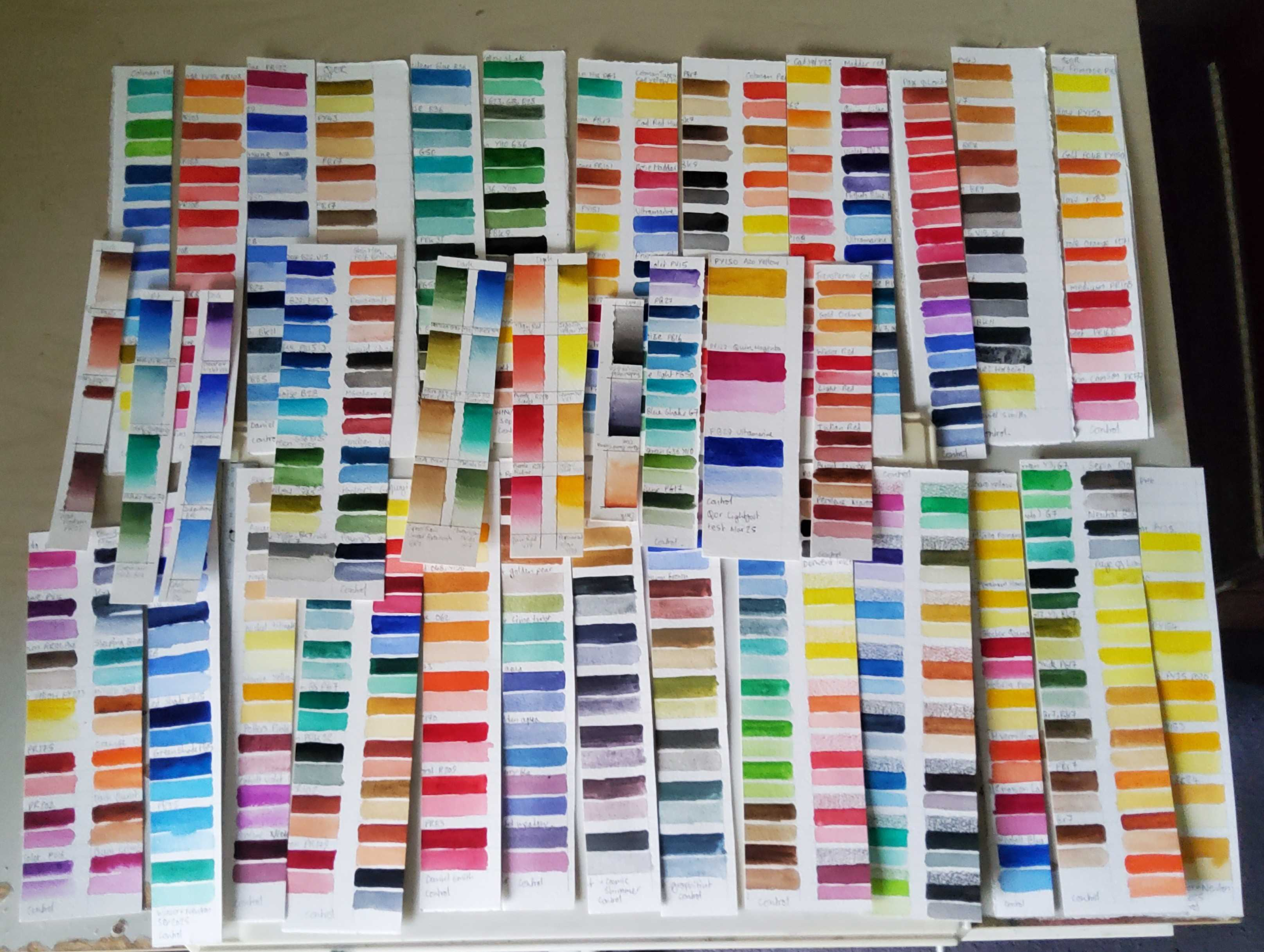
    The most definitive way to know how the specific paints you own will perform is to test them yourself. Which is how I’ve found myself with a mountain of 300+ paint swatches.

    Huge pile of swatches

    A few of these were done a while ago. The gradated swatches of Roman Szmal paints have been on display for 2 years. I’ll share my findings in the upcoming review of those paints, which should come out this week.

    Most of them are painted fresh, and have already been cut in half, one half as a control which is going in a box in a drawer, well away from light exposure. Before I put the exposure strips up, I’m just waiting for my official blue wool test scale to arrive.

    My older tests were just pinned to a sunny part of a wall for a year (or 2) and the paints that didn’t fade got a “well I guess this is fine” from me, but I want to be more accurate with the tests I do from now on. Using an official test strip will let me know when my paints have received enough light exposure to pass for a specific BWS rating.

    I need to use my window as a goddam window, so my tests are on a sunny indoor wall instead. I expect this will cause my experiments to take much longer than a standard test.

    All the new swatches are painted on the same paper- Winsor and Newton’s professional cold press. So there shouldn’t be any yellowing of the paper to throw the test results off.

    I’ve prepared tests for almost every colour I own. I’ve ommited some whites because I don’t think I’d be able to asses changes in white paint on white paper very well, and I seldom use white watercolour anyway. I haven’t tested the Kuretake granulating colours, but you can see how they did in Soo’s video here.

    Almost all colours have been painted in two stripes, one at masstone, and one in a more diluted wash. I did this by eye, without measuring the ammount of water I added to each mix precisely, so it won’t be the most scientific test. I still think this is much better than only testing the masstone. I’ve done a single strip for the Cosmic Shimmer paints, because they need to be applied quite thickly to get the sparkle effect to work.

    I’m also testing my Derwent Inktense pencils here, as I like them a lot but Derwent’s lightfast ratings are only accurate for the pencils when applied dry. I want to see how they do when activated with water, because that is primarily how I use them. These have 3 strips, one dry, one where the pencil was applied to the paper and activated with water, and one which was painted directly as a more diluted wash.

    Once I have the test scale arrives I’ll set them cooking and check them once a week by eye. As each blue wool strip fades I’ll report back with any paints that also show fading. These test results won’t be be purely based on light, the paints are also being subjected to background air pollution (I live on a busy main road) and the changes in temperature and humidity of a fairly typical UK home.

    I think that’s it for now. I’ll be back with that Roman Szmal review soon. Toodles.

  • What pigment is in your watercolour paint, and why it matters.

    What is a pigment?

    A pigment is a chemical compound that gives your paint its colour. Historically these may have been powders from ground up rocks, or laked dyes derived from plants. The majority of modern pigments are synthetic. There’s a whole history and chemistry lecture to explore in the nature of pigments, but today I just want to provide a quick and dirty low-down on why we care about which pigments are in our paints, and how to tell what they are.

    The most obvious point is that the pigment will determine the hue and value of your paint. The pigment also has a big impact on other important behavioural qualities.

    • How opaque or transparent the paint will be.
    • The tinting strength of the paint.
    • The staining power of the paint.
    • Whether the paint is granulating, or smooth.

    The maker’s specific recipe will also influence these things. The milling process and added fillers, brighteners, humectants and surfactants all play a role, but often the pigment will have the largest impact.

    How to find out what pigment is in your paint.

    Each pigment compound gets assigned two codes. The Colour Index Constitution Number is a 5 figure number, making it difficult to memorize or recognise.

    The Colour Index Generic Name Code is much more intuitive. In watercolour paint this will be in the format P(for pigment) followed by a letter code for the colour family (R for red, or B for blue, Br for brown etc.) then a number up to 3 digits long. For example PR108 is the generic name code assigned to Cadmium Red. Occasionally you might find a N instead of a P. For example the code for Winsor and Newton’s Rose Madder Genuine is NR9.

    The majority of artist grade paints will have the generic name codes somewhere on the packaging, although they are not legally required to disclose this information.

    Below I’ve included two examples of clear pigment labelling along the side of the paint tube. In this case both paints are made from PY43, yellow iron oxide.

    Tubes of yellow ochre watercolour paint

    Yellow iron oxide PY43 (natural) or PY42 (synthetic) is an inexpensive, widely available and permanent pigment, so there’d be no reason to use anything else to make yellow ochre, right. Right?

    pigment information on white nights pan wrapper

    Wrong. As shown in the above image, White Nights yellow ochre is made from a mixture of PY43 and PY154. It also paints out as a significantly lighter colour than either the Daniel Smith or the Winsor and Newton examples. This brings us to the next point:

    The marketing colour name may not correspond with the pigment.

    Paint manufacturers can give their colours any name they choose, and their marketing gurus will choose names based on what they think will sell. These usually fall into one of three groups:

    • Traditional. Generally these are names associated with current pigments such as Cobalt Blue or Cadmium Red. They also include historical colours such as Sepia or Vermillion. If the pigment is currently available (for example Cadmium Red) the paint should either contain the associated pigment, or be labelled as a “hue” paint, but always check to make sure. Sepia is no longer made from cuttlefish ink and may contain a variety of pigments designed to imitate the original red-brown colour.
    • Romantic. Colour names that may be either practical or poetic descriptors of how the colour appears or what you might paint with it. Examples might be “Bright Pink”or “Moonglow” or “Undersea Green.” These may be multipigment mixtures. They might be pigments where the generic name is difficult to remember or pronounce, making it less marketable.
    • Branding. This is where the company uses their own name as the paint colour descriptor, for example Winsor Red, (PR254 Pyrrole Red) or Blockx Red (also PR254 Pyrrole Red). I don’t really understand why paint makers do this. They usually (not always) stamp their own name on single pigment colours made with reliable modern synthetic organic pigments.

    Same pigment, different colour names.

    three swatches with the same pigment

    The above image shows examples of three paints with very different names, but the same pigment ingredient. From left to right we have Qor’s Phthatlo Blue Green Shade, Winsor and Newton’s Winsor Blue Green Shade and White Nights’ Bright Blue. In this case I believe Qor’s labelling is the most useful, as the pigment name is PB15 Phthalocyanine blue.

    Despite the different names, all three are similar in hue, transparent and staining, with good tinting strength.

    Same name, different pigments.

    The reverse can and does occur. Take a look at this party pack of Hooker’s greens.

    A variety of hooker's green swatches.

    Although all these paints are relatively transparent, there is a lot of variety in the hue and value.

    Sometimes I want to match a paint colour from another brand, either because I’m following an instructor who uses a brand I don’t have, or because I’ve run out of a favourite colour and want to pick a similar replacement from the mini mountain of paint I already own.

    It is usually a much more reliable to match colours using the pigment code, rather than looking for a colour with the same marketing name.

    This also makes it possible to imitate convenience colours you might not have. For example I have a sample of Daniel Smith’s Undersea Green, which is a lovely colour. It is made from PB29 (Ultramarine) PO48 (quinacridone burnt orange) and PY150 (Nickel Azo Yellow) all of which I own as single pigment paints. If I can get the proportions right I could potentially mix a very similar paint.

    Hue paints

    Another thing to keep an eye on is paints where the name has hue written at the end. These are designed to imitate colours where the genuine pigment is either fugitive, toxic, expensive, or a combination of all three. I’ve also seen hue colours labelled as “tint” or “imit” which is presumably an abbreviation of imitation.

    Hue paints are more common in student grade ranges (replacing expensive pigments)but they can be valid in artist grade ranges, for example as a more permanent alternative to the genuine Alizarin Crimson PR83.

    How close these imitations are varies wildly, so I’d suggest investigating them on a case by case basis.

    For example Aquafine’s Alizarin Crimson (hue) is paler, pinker, and duller than any of the 3 genuine alizarin crimson paints I’ve tried, which were all very similar. On the other hand Aquafine’s Cadmium Red (hue) is a similar colour to a real cadmium red, sitting somewhere between my Winsor and Newton Cadmium Red and my White Nights Cadmium Red Light. It is however more transparent than either of the real cadmium reds, so that’s something to keep in mind.

    Get to know your paints

    When following an instructor I like to paint with what I already have, which sometimes requires substitutions. Knowing the generic name code for the pigments in my paints allows me to make more informed choices for a close match.

    It is also very useful if you run out of a paint, only to find it has been discontinued. You may find the same pigment is still available from a different brand, or under a different marketing name.

    What do you think? Do you rely on the marketing names to chose your paint colours, or do you go by pigment codes?